

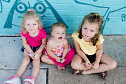
The wonderful people over at I Heart Faces are doing something great for us people who don't know the ins and outs of photography. They are helping us when it comes to editing our photos and making them better. I just got this camera two days ago and have played with it just a little. Here is a photo I took of Aislynn yesterday sitting on the swing on our back patio. It was in the afternoon around 4 so the light outside was quite bright. I tried to stay in the shade..but since we just planted our first tree this past weekend I didn't have much to choose from. Anyways here it is taken on Manual mode 1/100, F 5.6, ISO 100. I hope that means something to those photographers out there. It is still somewhat a foreign language to me.


5 comments:
Oh, my, what a sweet picture! Truly, straight out of camera it is so wonderful, from the beautiful skin to the fun expression. Any editing would be applied to just further enhance that.
I think your B&W lacks contrast, resulting in a rather gray image. Unless I flat out know a picture can only be shown in B&W, I do all editing to the color image, then convert at the very end. In your case, I would take the SOOC image and boost contrast. Not too much, or you will stat doing weird things to her skin tone. If Picnik has a saturation option, I would use that on her clothes and the background, avoiding her skin.
Your second edit looks too magenta to me, but the closer crop is very nice.
The 3rd crop does have the higher contrast and color saturation...maybe take this and convert to B&W and see how you like that result.
Out of all of them I like the black and white the best but I agree with the previous comment that it is lacking a bit in the contrast.
I love how the last edit brings out the color in her eyes.
Julie gave you some incredible advice above. I would love to work with your photo to see how I could help you, but I'm not able to click on your photo to save it to my computer. In the future, you might want to provide a link to a photo that we can all download so that we can help you out even more. It would be a lovely one to work with.
One thing I did notice is the curlicue in the chair. I would probably clone that out as it was a bit distracting...especially in the closely cropped edits.
What a beautiful subject you have to work with! :)
~Angie
co-founder of iHeartFaces
Hi again!
One thing you could do is put your photo into www.flickr.com (you can set up a free account there.) You could then just put a direct link to your photo so that we could all go pick it up there.
It's a gorgeous photo! If you end up doing this, let me know on my blog and I will be sure to work with it. It'll be fun! :)
~Angie
Have you ever done black and white with color?? I think the last edit would look good if you made everything black and white but her eyes. :)
Post a Comment