I would like to know which one you like best? Whenever I edit a photo I always end up doing so many versions of it because I like them all. Now I want to hear from you!! Let me know which one you like and why you like it. If there is one you don't like you can tell me that too and why you don't. I just can't get away from editing...it's taking up all my time!!
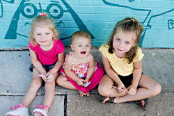
Here is the original:

Here are my edits:


15 comments:
I like the last one because she looks like a porcelain doll...stunning!!
So pretty, You did great on the editing! I love the last two.
They all look awesome but i think the second to last is my favorite! Oh and remember that when you reverse it like you did the last one, the words on her shirt will be backwards! Nice work on em all, what do you use to edit them?
They all look great, but I think my favorite is the last one (I'm not sure about the reverse part, but I like the colors)
(I like your new profile picture!) Why am I always out on my own voting? I like the first one best, far and away. I am not a selective color person, so that kind of takes 2 and 3 out of the running for me. But number 2, entirely in B&W would be lovely! You are getting so good with your editing!
I like #3! But they all look great!
My favorite is the last one, because there is a lot of pink in the picture (original & #1) & the last one shows the pink (which I like) with additional tones.
haha ok, i wasnt sure if you noticed lol. I still like it! And I use picnik as well! I really like it. Did you put the color on the b&w images with the paintbrush?
I like the last one best but they are all good even the original!
They are all beautiful but I love the third one. There's just something about it that makes the viewer focus on her face!
I love the third one. I think the last one is fantastic too ONLY since there is writing on her shirt I can totally tell that you flipped it. Other than that I really like the last two. BUT I am partial to black and white with color! :)
I love the last one's colors. Kambry is just so darn cute, it is hard to choose. You are so lucky to have 3 beautiful little girl models to take pictures of!!
I like the second Black and White one the best. Good job!
I like the second one the best - the crop and tilt are perfect. And you hit the nail on the head with your post-processing!
Post a Comment